
Looking for paint colors for kids room? Check out my favorite kids room colors here!
Picture this : a young couple buys a home and starts making it their own. What is it that you picture? I imagine an empty room covered carefully with drop cloths, paintbrushes, and an open can of paint next to the lovebirds who have charmingly used their rollers to paint a heart onto the wall, but not before getting a quick round of “let’s smear paint on each other’s faces” in.
It is easy to make painting the first task on your home renovation to-do list. It is quick and rewarding and can be a lot of fun (though I’ll be the first to tell the sweet couple rolling hearts all over their walls that they’d better leave a wet edge and they should really be going faster…oops!) but it can also be very intimidating. Choosing a paint color can feel like a very permanent decision – you can decide to return the lamp that you don’t love or move the art you just hung down a couple inches, but repainting is a bit more difficult to adjust (though I will add that if you don’t absolutely adore the color of your walls after you’ve lived in it for a couple of weeks, it is worth the time and effort to repaint it – I believe that you should love everything about where you live).
Want to see what projects I’m working on now? Follow me on Instagram!

There is a really good yet overlooked rule of thumb when it comes to choosing paint colors – choose your paint after you have chosen the main pieces that are going to go into you space. This includes furniture like couches and tables, light fixtures and lamps (and importantly lightbulbs), flooring, and any other focal pieces you want in your space. Find a couple of items that you love and go from there. Don’t let something as fluid as paint color dictate whether or not that cabinet or ottoman that you fell in love with is going to work in your space.
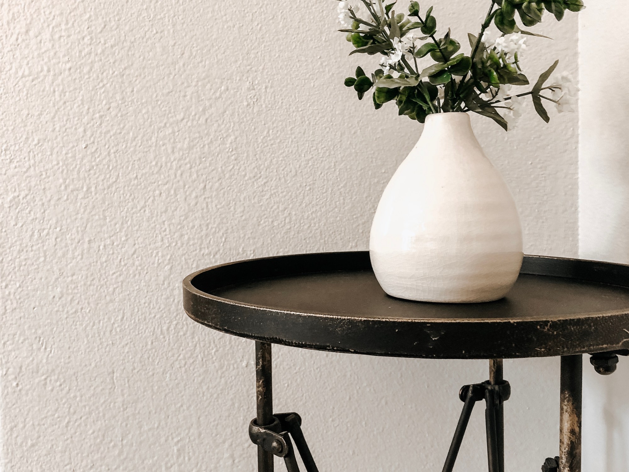
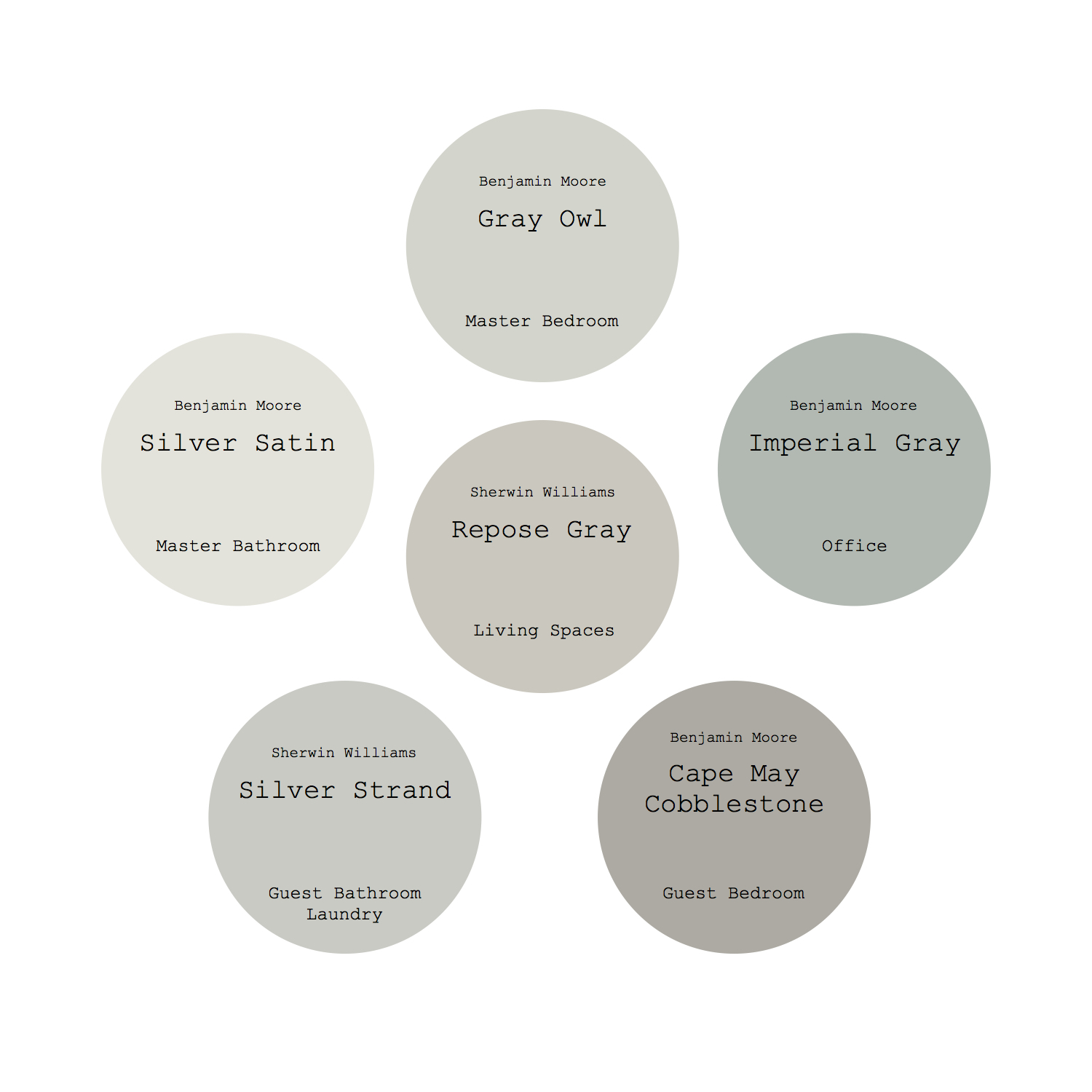
Before we had left Utah, we had purchased our flooring and had chosen our couches, light fixtures, rug, and other important things for our living area and I knew I wanted a nice, warm gray for the walls (is anyone surprised?). I had a couple of different colors in mind (mainly Mindful Gray, Agreeable Gray, and Repose Gray) but I wanted to get into the space before making a final decision.
‘Weird’ does not even begin to describe the way that this house had been painted. Every room was exactly the same color, or at least I think it was supposed to be? I wish it came across better in pictures because the best way I can describe how it looked in person was some mixture of beige and pea green. It may have been the right color for the previous owner’s decor and style, but it wasn’t going to be the right color for us. This is likely going to hold true for almost any home that you buy. Paint color should go with your decor and unless you have the same stuff as your sellers, you’re probably going to need to paint your house in order to love the way it looks.
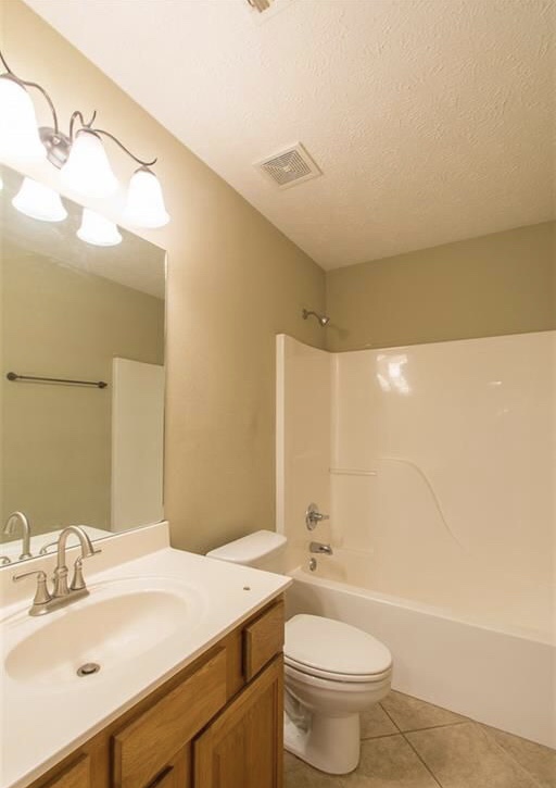
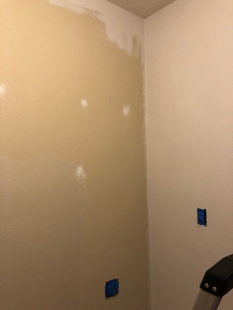
The color itself was not my taste, but it was not the weird part of the paint job. It seemed that some walls were painted with a more greenish version of the color and some walls were more beige-y. There was no rhyme or reason behind this and some of the greener walls were touched up with the beige-y paint and some of the beige walls touched up with the greener paint. But wait… there’s more! Different walls (and sometimes even different portions of the same wall) were painted with different sheens! I am pretty confident that I found everything from matte to semi-gloss in our living space alone. We were ready for a uniform and fresh coat!
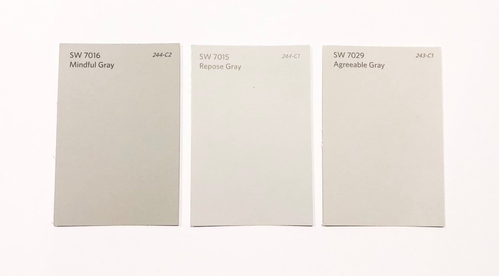
The amount and color of light coming into a room will change how the color looks, so I switched our bulbs out for the brightness and color I wanted. Taking into account our lighting (including the amount of windows) and the other finishes we had chosen for our home, I landed on Agreeable Gray.

It took me a full day to get one coat on the living room and dining room walls and then J and I sped through a quick second coat in about 2 hours the next day. We have a great open floor plan, so our living room, dining room, play space, and kitchen are all connected and so the walls all needed to be the same color. Over the next couple of weeks, I very slowly worked my way through the kitchen, play space, and hallway and then we were all done! Yay for no more blotchy, beige-green walls!

Here are a few tips for making sure that you chose the right paint color :
- Chose your color that will accentuate the things you love rather than dictate what you can put in your space.
- Go with more muted tones and leave the bright colors for decor or accent walls – paint will always appear more vibrant when it is covering the walls than it did when you chose it.
- Give your house some variety by changing the color as you go from room to room, but don’t give yourself whiplash by choosing paint colors that don’t flow well together for different rooms – think about the color of all your rooms together and make sure they make a pretty palette.
- If you’re indecisive, paint a swatch on multiple walls and look at them at different times of the day before making your final call.
- Splurge a bit on the quality of your paint by getting something mid-range or better – you’ll use less paint and less elbow grease.
- White is a great wall color, but pure white almost always will look dingy. A quick Pinterest search of “best white wall color” will yield many great options to test in your house (White Dove, Simply White, and Chantilly Lace are some of my favorites).
- Grays with even a little bit of blue undertone tend to look purple against wood tones, so go with a warm gray to avoid that.
- If you don’t love it after you’ve lived with it for a bit, change it!
Since painting our living space, I’ve also painted the rest of the rooms in our house and here is my current color palette.

These are a couple more palettes that I put together that would be so pretty! At least, as long as the colors looked good with the things destined for that space and the lighting worked well with those colors… but hey! Maybe it’ll get you thinking about a color that would make your house feel more like your home!


With love,
Mercedes ♥

Hi Mercedes,
I noticed your comment about your master bedroom color changing soon and wondered if it was the BM Quiet Moments that you are changing. I am considering using it in my master bedroom also and was wondering why you were changing it or if you had any opinions/feedback for me about this color.
Thanks,
Carrie
LikeLike
Yes! So we changed it from Quiet Moments to Pale Oak with an accent wall of Knoxville Gray. There wasn’t anything wrong with that color, it’s a great blue if that’s what you’re wanting! I just decided I wanted more neutral walls with a bold accent wall, so that’s why we changed it 🙂
LikeLike